Denamik introduces the Denamik Analyzer, an add-on to the Denamik LoadGen product. With Denamik LoadGen one can perform load- and stress tests on hosted shared and hosted private infrastructures like Citrix XenApp and XenDestop.
While the LoadGen executes a test and gathers data about the performance metrics and response times, visualizing and analyzing the data required a third party solution and knowledge about the performance indicators. The Denamik Analyzer now enables you to analyze the captured data, create and save charts and start creating a report in minutes.
I’ve had the opportunity to play with an early release of the Denamik Analyzer in my lab and get some hands-on experience.
PEAR
Each performance test consists of four basic phases:
- Preparation – the requirements are discussed and the test environment is built;
- Execution – infrastructure is tested with the simulated load
- Analysis – the gathered data is analyzed and compared with expectations and requirements
- Report – the gathered data and analysis is stored in a report, ready for the customer

With the Denamik LoadGen you already had the tool to perform the first two phases: prepare and perform a load- or stress test, capture performance data of the systems under test (SUT) and the response time measured from the client perspective. Meaning, the response time as the user would perceive it (also known as client side testing).
Now with the Denamik Analyzer the analysis of the captured data is a matter of a few clicks, creating and customizing charts and saving them in a report. In the past this process took me numerous hours, sometimes days, this is now reduced to 30 minutes.
My experiences
The Denamik Analyzer has some interesting features that simplifies the last two phases of a performance test but also the improved the previous phase, the execution of the test. The product has a rich list of features in a user friendly interface.
Interface
On start-up of the program you’re welcomed with a “startup help” showing how to use the application. I highly recommend you read the pages (normally I always skip them) and you’ll understand how the application works.
 From the moment I started working with the application I’m impressed with the intuitive interface. During the steps of the startup help the application in the background shows you a rectangle where the discussed topic can be found.
The application is filled with those simple, but effective, visual tricks to guide you through the application.
Another thing that really impressed me is the speed at which the application can process huge amounts of data. Even really big databases tests that took hours and collected data of hundreds of servers is processed in seconds. That’s really a huge time saver.
Charts
The main feature of the Denamik Analyzer is the ability to create charts of the data capture by Denamik LoadGen. What is important to know is that the data should be stored in a SQL database, XML files are not supported.
Common charts
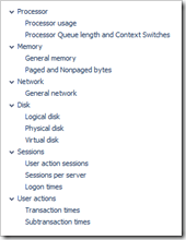
Denamik provides you with a set of commonly used charts which are preconfigured for you. The common charts enable you to quickly create charts with, as the name suggests, common performance indicators. What’s very cool about the common charts is that you can customize them very easily. For most of my charts I started with a common chart and adapted it for my specific needs.
The common charts that are supplied by Denamik have two major benefits 1) it saves lot of time not having to create them yourself and 2) you don’t have to be an expert on the data captured by Denamik LoadGen to collect valuable information.
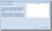
 A user can right-click on a common chart and click on the What is <common chart name>? and detailed information is provided about the content of the common chart.
Axis
 On each chart one X-axis (time) and two Y-axis are available to present the data. Having two Y-axis available enables you to compare data from two different sources. For example you can compare the processor usage versus the memory usage. But probably more interestingly: you can compare the processor usage versus the response time of an application answering the question ”what is the impact of the processor usage on the user experience”.
Look and feel
When the result of a performance test is presented to a customer it’s important to highlight certain data. Charts can be beautiful showing amazing data, but a customer needs to understand what you’re showing them. Partly this can be done in writing or explanation, but a picture is worth a thousand words.
The look and feel of every chart can be changed to you needs. This includes the captions, fonts, colors, grid but also the scale of the axes’.
 A cool feature IMHO is the ability to add strips, a certain region you want to highlight. If you for example want to highlight that processor usage above 60% is generally slowing down a computer, and even more at 80% a strip can visualize this. And while you’re at it, you want to highlight a certain period in the test and refer to a chapter in your report.
Custom charts
While the common charts are a very good way to start, you might want to customize them a bit more. A common chart can be customized in three areas:
- Data – Enables you to narrow down on the exact data you want to see. You can for instance select a certain performance indicator, a (sub) transaction time or number of active sessions.
- Grouping – Data shown in the chart can be grouped by a certain field instead of showing all instances (for instance all machines)
- Functions – The data shown is the “raw” data, each value that’s captured and stored in the database is shown. To improve the visibility and analysis it helps to apply a function that calculates the average, moving average or for instance show only the data that falls in a certain percentile.
 Let’s use the same example as previously. This time I want to see the time required to open a word document, but only between the 5th and 95th percentile, of that data I want to take the moving average (of every 60 seconds) and make it a spline (instead of a line) to improve the visual effect. Instead of showing the processor usage of each machine individually, which give more or less the same result, we’re calculating the average per grouped item.
Chart series list
 The values of the performance indicators are shown graphically in the chart, but customization has only been done for all lines at the same time. By showing the chart series list the color and width of each line can be customized individually. Lines can be hidden or highlighted to get more attention.
Chart comment
 For each chart a comment can be written, this comment will be added to the chart when a report is created. But more on that later.
Indicators
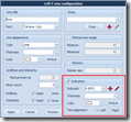
 This feature I’m particularly proud of: indicators can show you how an average person would rate the response time of a machine. I’ve done extensive research on this subject and wrote a whitepaper about “Quantify perceived performance”. Basically what I found was that the actions we perform while interacting with a computer can be categorized (A, B and C) and rate the response time for an average human. This way we’re not only able to tell how long a user actions took but also if it’s good, bad or something in between.
 Looking at the example, opening a (Word) document is a category B action. What’s very easy to see is that 96% of the test the response time was Excellent and only after 1 hour and 15 minutes the users would rate the response time somewhere between Good (2.7%), Fair (0.6%), Poor (0.4%) or Unacceptable (0.4%).
User charts
After a (common) chart is created and customized to your needs you want to persist your changes so you can re-use the charts. Once a chart is customized and saved it is called a “user chart”. The benefit of saving a user chart is that you can re-use it over and over again. Every time you perform another test at the same customer, but also for other customers. That makes the Denamik Analyzer a valuable tool for every partner or consultant that executes performance tests more than once.
User charts are saved on disk in a single file (file extension .dnk), so you can easily share the templates of the charts with your customer, colleagues or the community!
Export
Charts that are created in Denamik Analyzer, showing the data captured by Denamik LoadGen, can be saved on the disk. Each chart can be exported individually, all open charts can be exported or a batch export can be performed.
Charts are exported to a PNG format, but can also be exported to BMP, GIF, JPEG and TIFF. By default each chart has a dimension of 1024×768 but this can be changed to your needs.
Report
After executing a performance charts, collecting the data, creating the charts and customizing them they need to be presented to your customer. Denamik Analyzer can create a report for you in four formats:
- PDF – Adobe Portable Document Format
- DOC – Microsoft Word Format
- HTML – Webpage Format
- XLS – Microsoft Excel Format
Depending on your requirements you can create a simple PDF or HTML document that includes all charts (including the chart comments) for quick review, or a Microsoft Word document that allows you to continue editing the document with your analysis and conclusion.
 I’ve created a simple report with the charts created for this article. You can download the document here:
Example report
.
Live monitoring
I’ve mentioned this already in the beginning of the article, Denamik Analyzer also improves the execution phases of a performance test.
Once a performance test is started load is simulated and the infrastructure has to cope with that load. The performance metrics of the systems under test (SUT), and the response times of the applications, are captured by Denamik LoadGen and stored in a datastore. Monitoring the environment during a test is a cumbersome process which involves logging in the machines or running perfmon to collect performance data of the machines. This approach has two drawbacks 1) you’re influencing the test and therefore the results and 2) you cannot visualize any captured response times.
With the Live Monitoring feature of Denamik Analyze you can now view the content of the Denamik LoadGen datastore during the performance test. As the name implies it monitors the captured data and shows it in your chart. Yep, you can show all the data as you do after the test. Customize the visuals and combine multiple data sources (eg. processor time vs. response time, number of users vs. memory usage, etc.)
“Live monitoring is the cherry on the Denamik Analyzer cake”
Licensing
A trial version of the Denamik Analyzer will come available on the website of Denamik. The trial version is free for all Denamik LoadGen customers and offers almost all features except creating custom charts and enabling live view. Also, a a watermark is added to the chart in the trial version.
The price of the Enterprise version is expected at 2500 EUR (or ~ 3500 USD) . Customers who purchases a Denamik LoadGen license of 1000 virtual users (or more) will get the license for free, customers with software maintenance included.
Release date
The Denamik Analyzer is expected to be released on May 22nd 2013.
